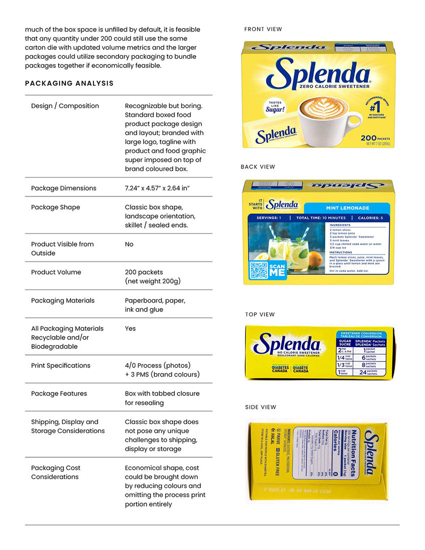
The objective of this project was to redesign the existing boxed food packaging, including its branding. During my research, I identified a gap in the artificial sweetener market: despite significant growth potential, most brands rely on outdated, basic packaging.
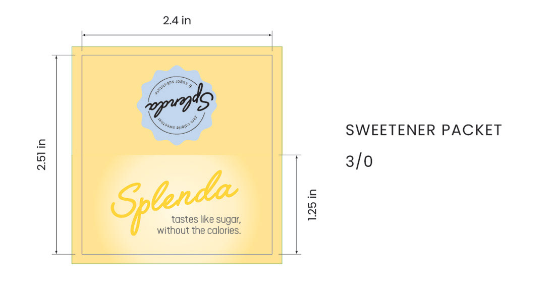
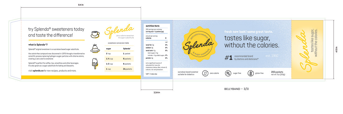
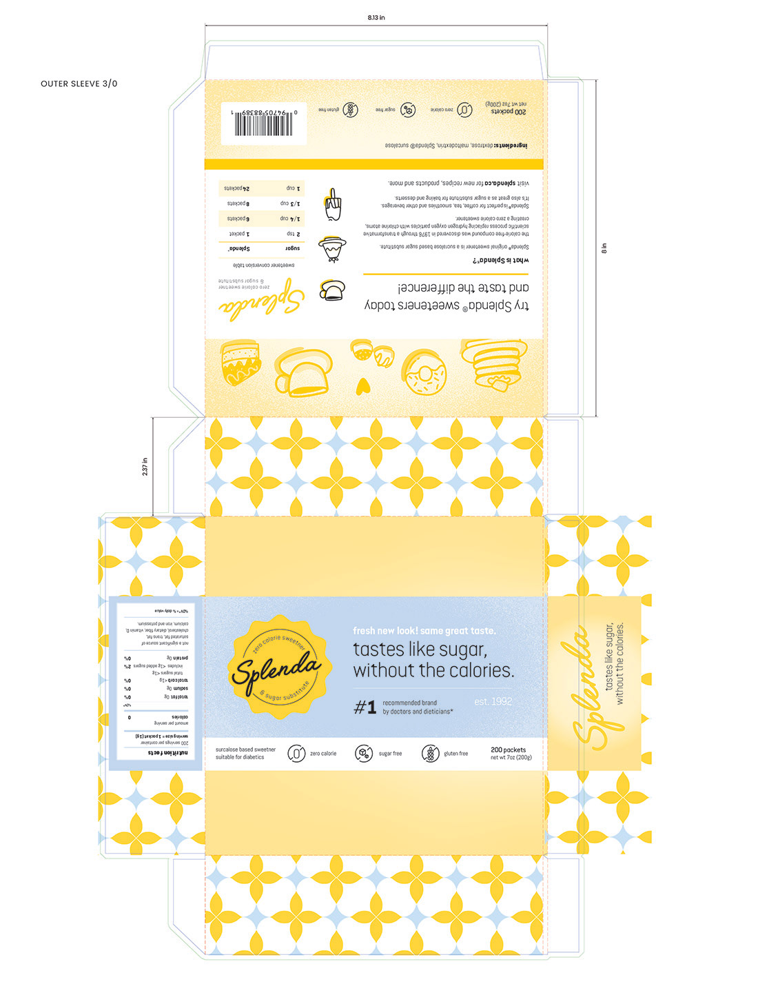
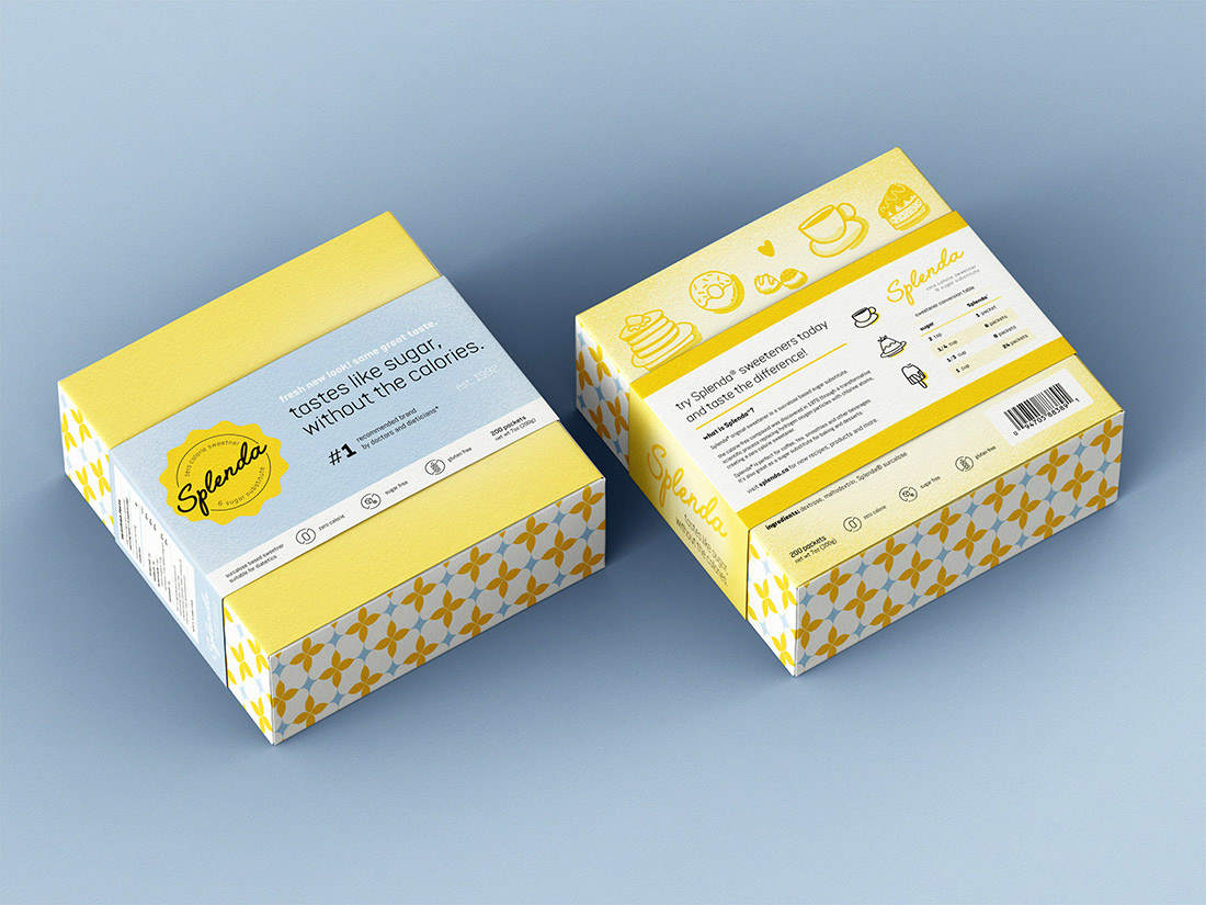
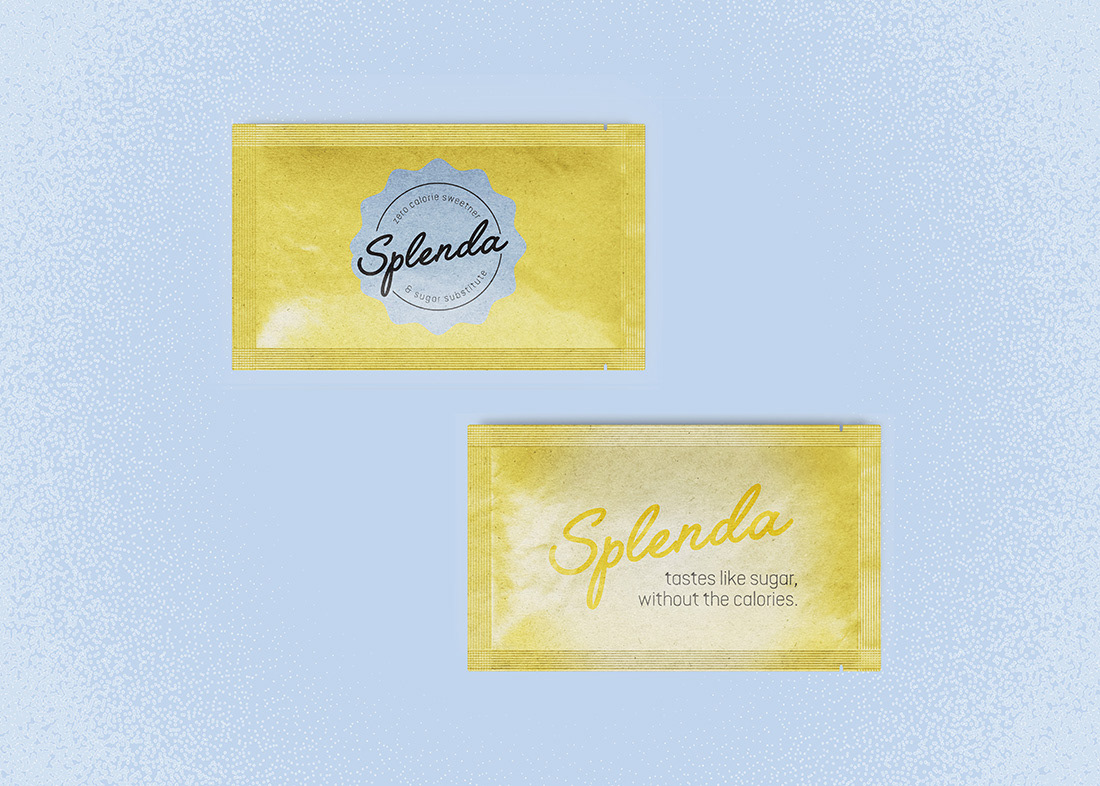
My redesign of Splenda’s 200-packet carton seeks to fill this gap by enhancing both visual appeal and functionality. The new design offers a unique, premium look that helps Splenda stand out on store shelves, setting it apart in a market where packaging has traditionally been under utilized as a brand asset. This more intricate design aims to better engage consumers and capture attention in a competitive space.
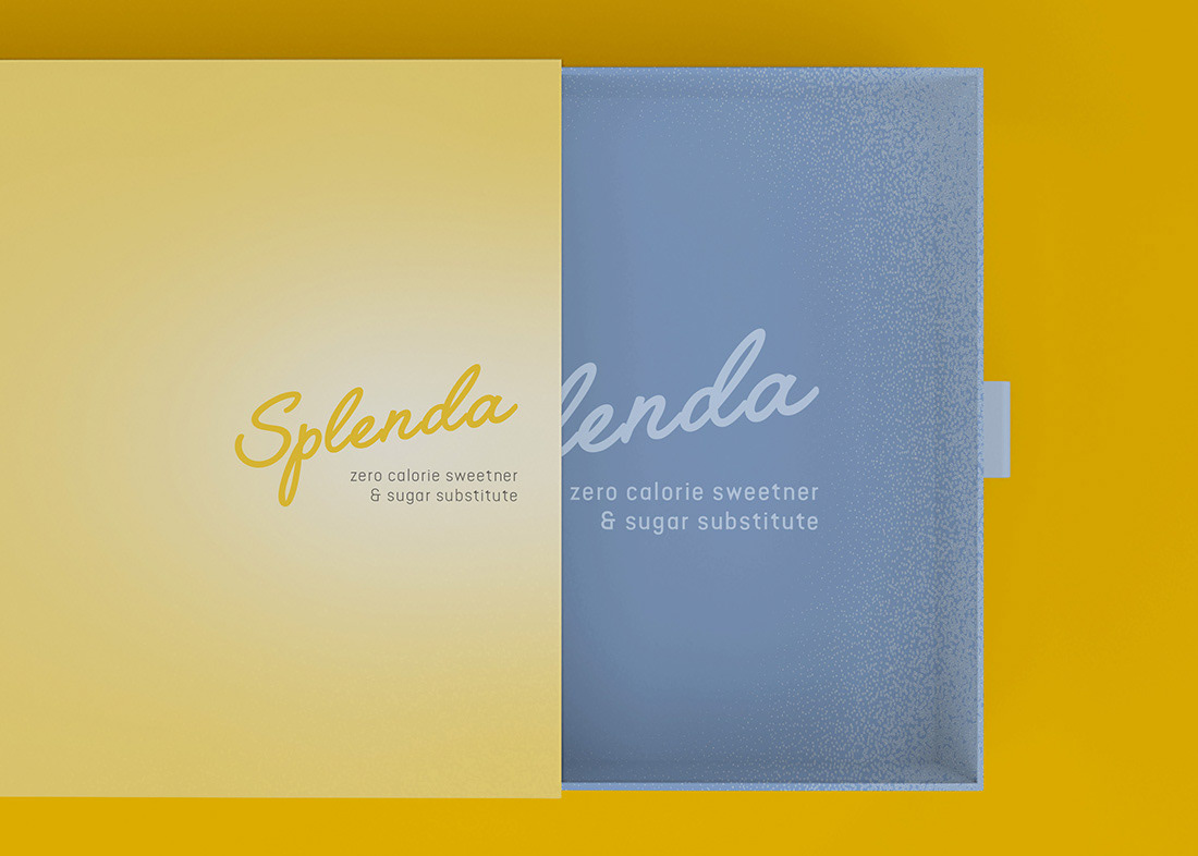
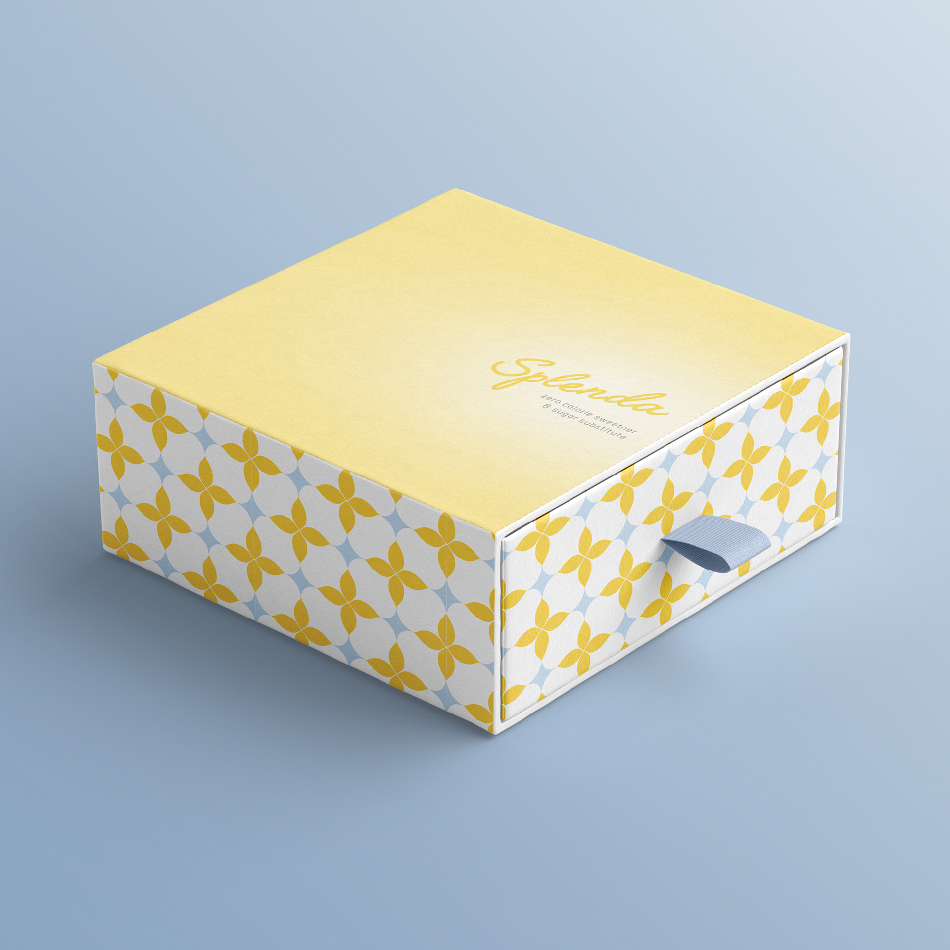
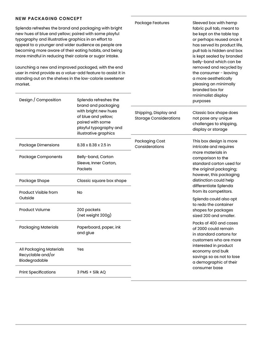
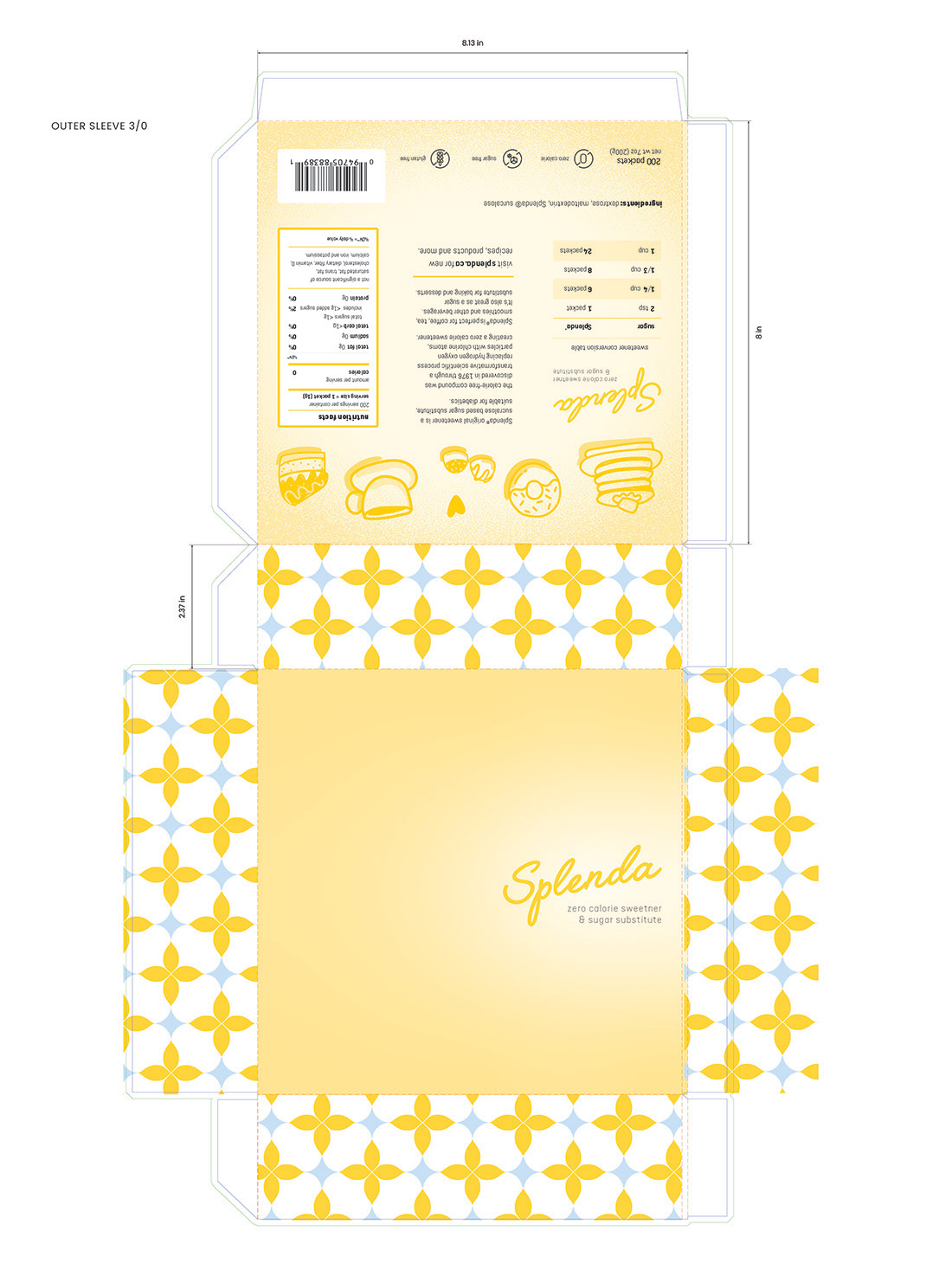
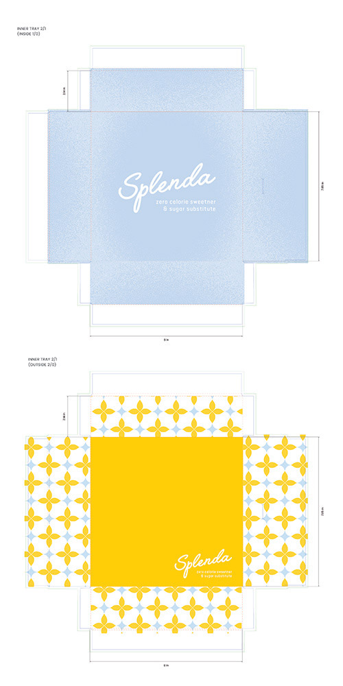
I also focused on adding value to both the consumer and user experience by reimagining how the packaging could function beyond its initial appearance. Recognizing that consumer-facing branding often clutters the shelf space with overly flashy designs, I streamlined this aspect of the packaging. The redesign removes the gaudy, overly commercialized front branding, instead revealing a more refined, classic, retro-inspired tab slide box.
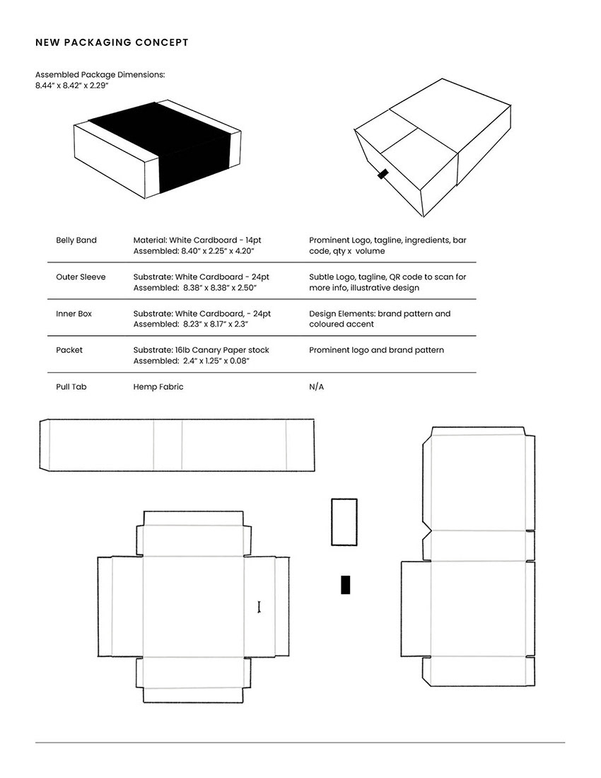
This design not only creates a visually appealing, timeless look but also enhances the user experience by offering a practical and elegant way to store the product. The updated packaging is aesthetically pleasing and sophisticated enough to be displayed on kitchen countertops without being an eyesore, offering convenience for the consumer while elevating the product’s overall presentation.